The Story Behind ArcDeco’s New Look
When we began reimagining ArcDeco’s identity, we knew the logo needed to do more than simply look good. It needed to tell a story—one rooted in how we think about design, the spaces we create, and the people who inhabit them.
At first glance, the ArcDeco logo is a simple, geometric symbol. But like the best architecture, its meaning reveals itself layer by layer.
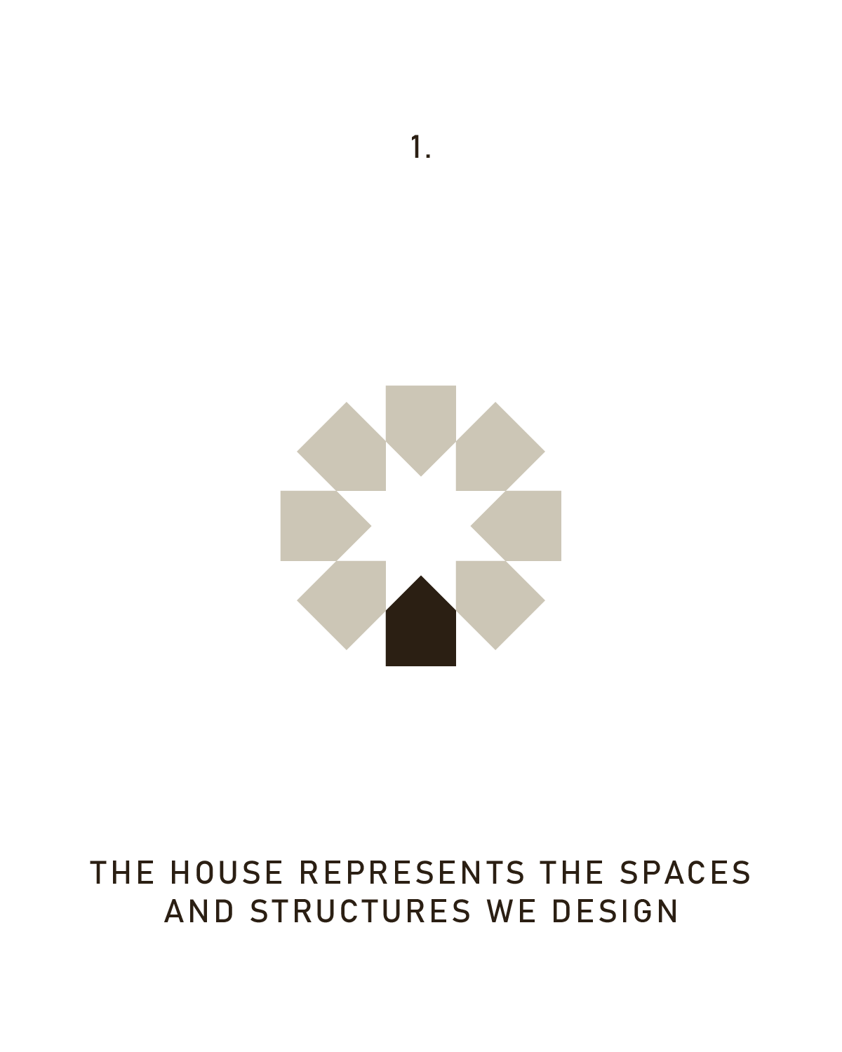
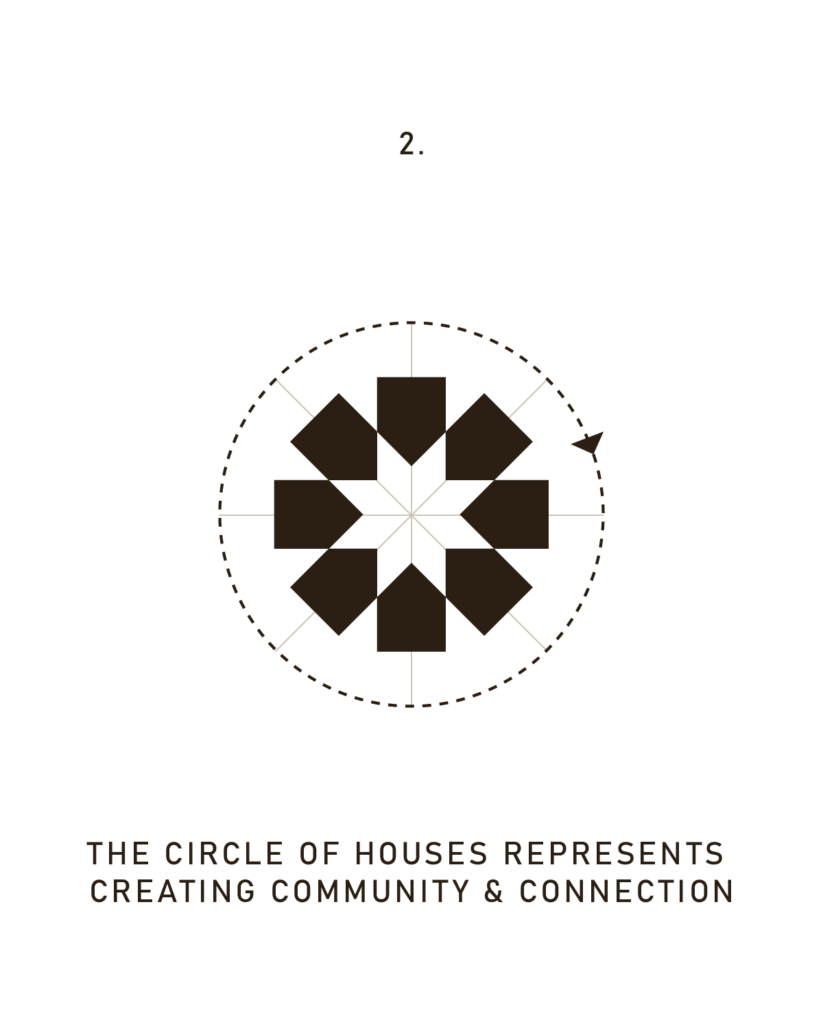
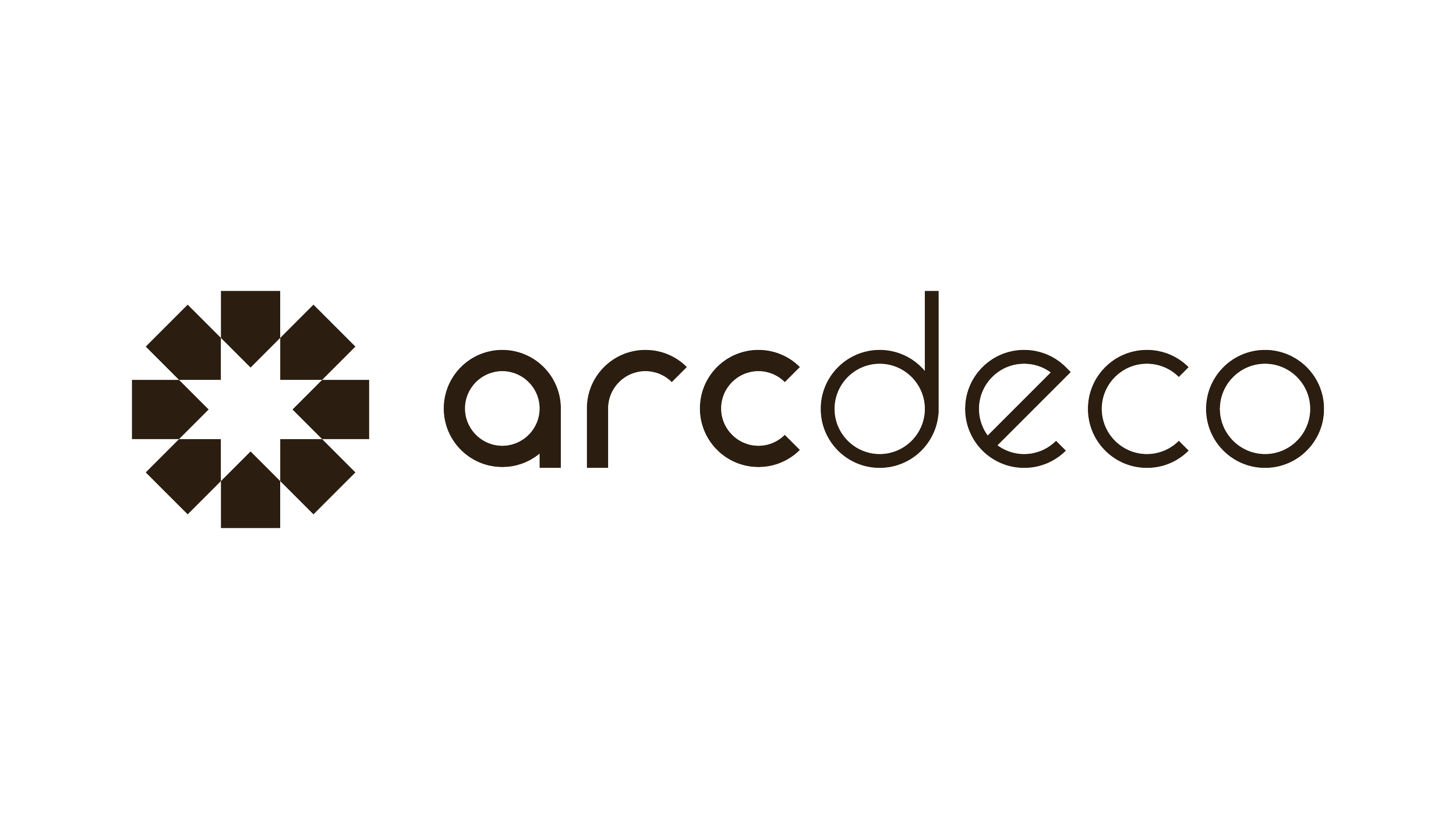
At the foundation of the mark is the house shape, representing the homes and structures we design—spaces built to support real life, whether that’s a family kitchen, a quiet bedroom retreat, or a thoughtfully planned commercial space. From there, the form expands outward into a circle of repeated shapes, suggesting a neighborhood or gathering. This circular arrangement reflects one of ArcDeco’s core beliefs: that good design fosters connection—between rooms, between people, and between the built environment and the lives unfolding within it.
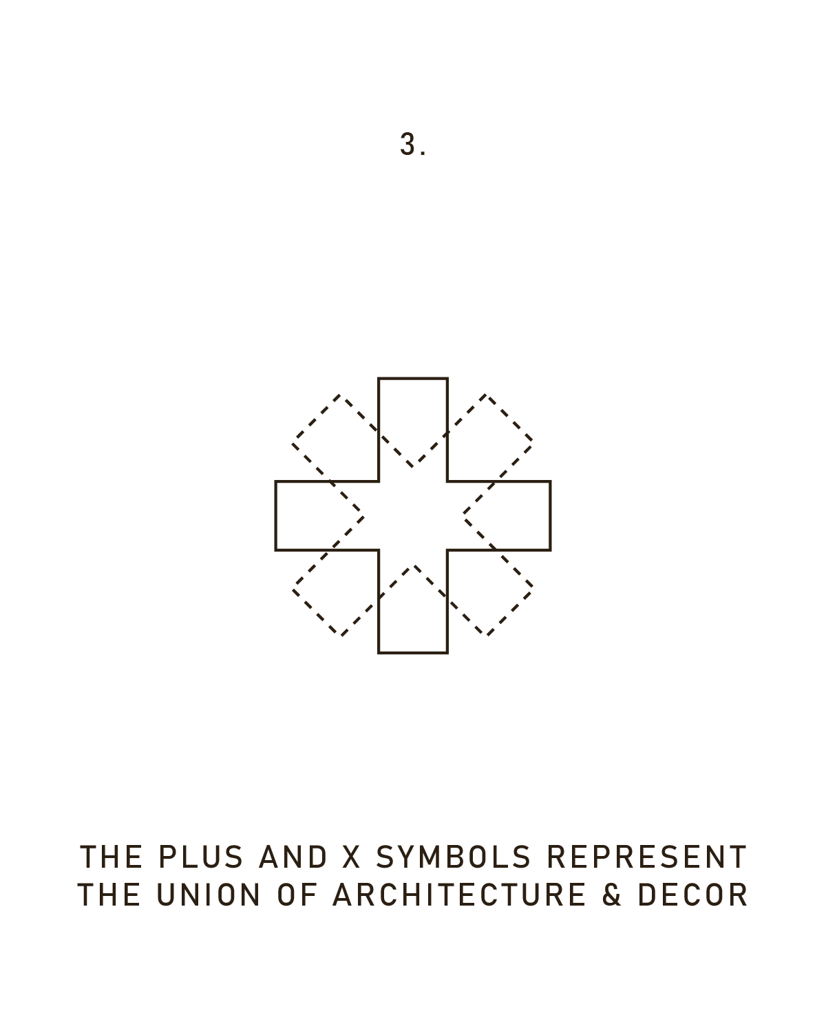
At the center, a subtle plus and X motif emerges, symbolizing the union of architecture and decor. These two disciplines are often treated separately, but at ArcDeco, they are inseparable. Structure and finish, flow and feeling, planning and personality—each is stronger when considered together. The logo brings those elements into balance, visually reinforcing the holistic approach that defines the studio’s work.
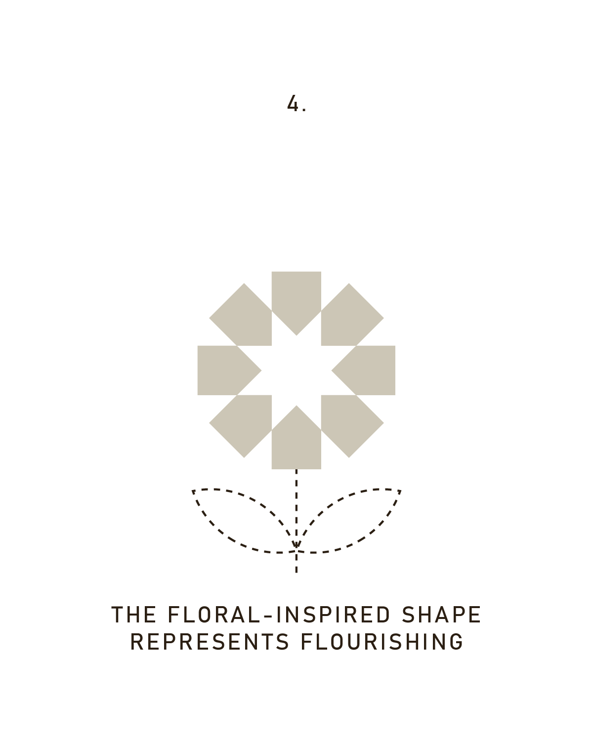
When viewed at a distance, the logo takes on a floral quality—an intentional nod to growth, flourishing, and longevity. The design of a structure or space, at its best, isn’t static. It grows with the people who use it, adapts over time, and supports life in all its seasons. This sense of movement and vitality is baked directly into the mark.
That same care carries through to the ArcDeco wordmark. The logotype is completely custom and built with the same geometric discipline as the symbol itself. Each letterform is constructed from precise circular shapes and intentional angles, giving the type a sense of order and clarity without feeling rigid. The result is a mid-century, retro-modern character—timeless, considered, and quietly expressive—that closely reflects the studio’s design sensibility.
Subtle details within the lettering add depth and balance. The weight of “Arc” is slightly heavier than “Deco,” creating a gentle distinction between the two parts of the name while keeping the overall mark cohesive. Carefully placed angles and curves echo the geometry of the symbol, reinforcing the idea that every element of the brand is working from the same foundation.
When the symbol and wordmark appear together, they feel naturally connected. Both rely on shared geometry, circular forms, and angled cuts, allowing them to balance one another visually. The symbol brings meaning and movement; the wordmark grounds it with clarity and structure. Together, they create a visual identity that feels architectural yet inviting—structured but never cold.
Taken as a whole, the ArcDeco logo reflects what the studio values most: thoughtful design, grounded in intention and elevated by detail. It represents a holistic approach to creating spaces that are not only beautiful, but deeply livable—spaces where structure and decor, planning and personality, come together seamlessly.
We’re excited to share more about the thinking behind the brand in the weeks ahead. For now, we’re proud to introduce a logo that feels like a true reflection of ArcDeco—where everything is considered, and where spaces are designed to flourish.
Logo, website, and Brand Design By Meg Feys
